Em :official_verified:
boosted

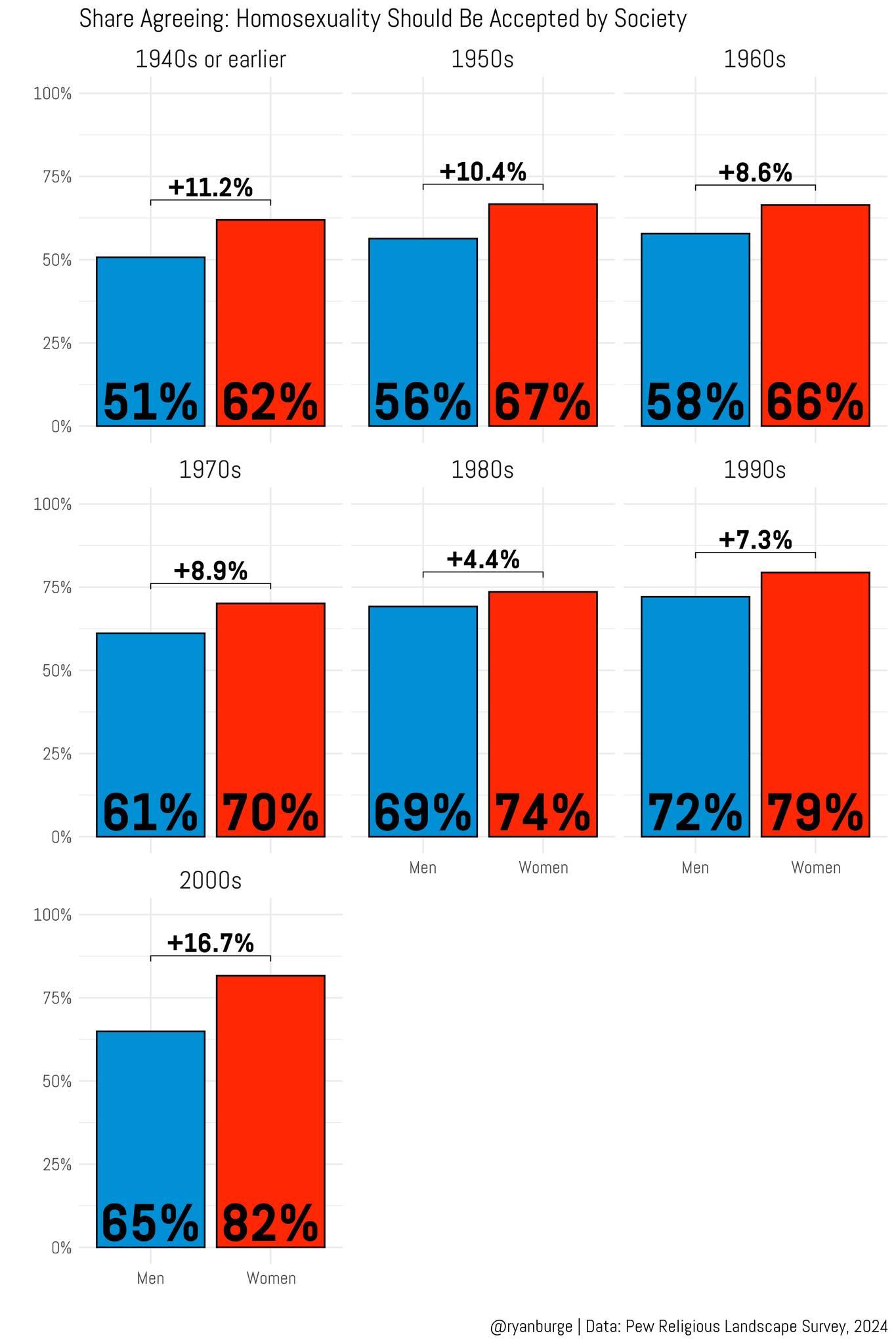
"'Homosexuality should be accepted by society.'
The biggest gender gap on that question:
It's among men and women born in the early 2000s.
65% of young men agree
82% of young women agree.
A nearly 17 pt divide.
It's just 7 points among people born in the 1990s."
~ Ryan Burge
Now let's do how those younger males voted — in comparison to young women — in 2024.
#homophobia #heterosexism #GenZ #MaleEntitlement #MaleDomination #GenderGap